It's hard to pinpoint exactly what makes New York City the unique experience that it is. Maybe it's because you're always bumping into surprises. So much so that you get to a point where you expect it. Here are a few random surprises from my last trip to NYC.
Subway mosaics are everywhere. But I wasn't expecting this wall of golden mosaic, reminiscent of a Gustav Klimt painting.
Retail is an endless source of surprise in New York. Here are two examples. First, on the way to the Metropolitan Museum of Art we ran into the Gagosian store with these fantastic Murakami inflatables in the window.
I didn't make it out of the store without purchasing a stuffed version of the artist's iconic mushroom-cloud skull complete with brightly-colored flower eyes.
At the normally impossible-to-spot Commes des Garcons (CDG) store in Chelsea, the urban-camouflaged storefront was lavishly festooned in preparation for the release of a line of clothing co-designed with Matt Groening, the creator of the Simpsons.
The CDG store still sported its tags by some of the world's best street artists like this from the artist known as Space Invader.
If my street-art creds were better, I'd know the name of the artist responsible for this sidewalk painting.
Finally, I like the way art by today's most noted artists just seems to magically appear. On a gray, rainy day near the noise and chaos of the World Trade Center construction site this spectacular crush of metallic red, Jeff Koons' Balloon Flower (Red), is a delightful surprise.
Tuesday, August 2, 2011
Utah quilted.
Recently, I visited the LDS' Church History Museum to see the works by LeConte Stewart. While I was there, I ran into another exhibit, Pieces of Me: Quilted Expressions of Human Ties. The exhibit is presented in a way that can only be described as garish. And it's next to the museum's permanent exhibit, A Book of Mormon Celebration for Children, which means the galleries were filled with a lot screaming and banging. I'm still not sure how the kids were celebrating the Book of Mormon, but it involved a lot of yelling and a whole lot of banging blocks or hammers or something.
But even with all of that, there are some interesting quiltss to see at this exhibit. Let's start with the 19th Century, dizzying handiwork of Thomas and Betsy Bullock. Robbing Peter to Pay Paul delivers an intoxicating pattern with astonishing quilting.
And if you think that people might have to be mentally unstable to undertake projects like this you might be right. Seymour B. Young, who was the director of the Utah asylum for the insane, believed that minds must be kept busy to aid the health and well being of the patients. So he taught patients craftsmanship skills like quilt making. The result? The psychedelic imagery of Asylum Quilt (circa 1877) created by the patients.
There are also some delightfully strange quilts celebrating Mormon milestones. To All Worthy Male Members created in 1990 by Emma Allebes celebrates the 1978 announcement allowing blacks to hold the priesthood.
My favorite quilt in the show is Do Not Remove by Penalty of Law created in 2008 by Miriam and Michael Zabriskie. This large quilt is decorated with hundreds of tags taken from clothing, most of them old and many of them with ties to Salt Lake City. I spent a good ten minutes lost in the intrigue.
I love this label from The Paris, Salt Lake City. I'm thinking of requiring all of my friends to now refer to me as "The Paris."
And how about this, Bill Blass created clothes specifically for ZCMI. I've never missed ZCMI more. Oh, and look. It's Botany 500 creating clothes for The Paris, Salt Lake City. That's right, The Paris gets clothes from all the top brands of the day.
But even with all of that, there are some interesting quiltss to see at this exhibit. Let's start with the 19th Century, dizzying handiwork of Thomas and Betsy Bullock. Robbing Peter to Pay Paul delivers an intoxicating pattern with astonishing quilting.
And if you think that people might have to be mentally unstable to undertake projects like this you might be right. Seymour B. Young, who was the director of the Utah asylum for the insane, believed that minds must be kept busy to aid the health and well being of the patients. So he taught patients craftsmanship skills like quilt making. The result? The psychedelic imagery of Asylum Quilt (circa 1877) created by the patients.
There are also some delightfully strange quilts celebrating Mormon milestones. To All Worthy Male Members created in 1990 by Emma Allebes celebrates the 1978 announcement allowing blacks to hold the priesthood.
My favorite quilt in the show is Do Not Remove by Penalty of Law created in 2008 by Miriam and Michael Zabriskie. This large quilt is decorated with hundreds of tags taken from clothing, most of them old and many of them with ties to Salt Lake City. I spent a good ten minutes lost in the intrigue.
I love this label from The Paris, Salt Lake City. I'm thinking of requiring all of my friends to now refer to me as "The Paris."
And how about this, Bill Blass created clothes specifically for ZCMI. I've never missed ZCMI more. Oh, and look. It's Botany 500 creating clothes for The Paris, Salt Lake City. That's right, The Paris gets clothes from all the top brands of the day.
Monday, August 1, 2011
Utah painted.
Here's a surprise. The Salt Lake Art Center is not open on Sundays, which has always bugged me a little bit because I think Sunday afternoons were meant for museum visits. The surprise? The Church of Jesus Christ of Latter-Day Saints' Church History Museum is open on Sundays. For an organization that believes in keeping the sabbath day holy, I was pleasantly surprised to discover the Church agrees that visiting a museum is an appropriate activity for a Sunday afternoon.
How did I discover this fact? Well, I went to the museum as my second stop on Salt Lake City's current circuit of LeConte Stewart exhibits. There are two shows featuring the artist's work; a joint effort by the Utah Museum of Fine Arts (UMFA) and the Church History Museum. I started at UMFA to see more Stewart paintings in one location than you'll ever see again. And all of those paintings represent places in Utah.
The exhibit at UMFA is titled LeConte Stewart: Depression Era Art. I wasn't expecting to like the show as much as I did. Stewart's paintings from the 1930s are melancholy, even bleak. That realization that things were troubling for many Americans during the depression makes this show relevant today. Here are some paintings I found interesting.
A whole gallery is dedicated to the idea that small businesses struggle in a bad economy. Hometown businesses shutting down were featured in a number of Stewart's paintings. As the son of a small business owner, I found these paintings beautiful. Here's Untitled (The Golden Rule) (c. 1930s, oil on board), my photo may not show the detail, but the business shows torn curtains and broken windows.
And here is the Green Front (1935, oil on canvas), which shows a general store in Kaysville, Utah owned by W.D. Adams and Sons. While the store survived the depression, the painting still evokes the realities of doing business in a struggling economy.
I enjoyed seeing Stewart's painting process in action. Stewart worked from real life, not from photographs. He made sketches and then painted studies before completing the final work, and many of those studies were beautiful and on display.
For example, Smith's House (1937, oil on canvas) was shown next to one sketch and two oil studies.
Then there's this photo of a brilliant painting, Approved by Postmaster General (1936, oil on canvas) shown next to a small study for the same painting.
One of my favorite paintings in the show is Private Car (1937, oil on canvas) showing unemployed men hitching a ride on a train in hopes of finding work somewhere else. By the way, what a great title for a painting exploring this subject matter.
In the study for the painting, the men are absent. While beautiful, it somehow lacks the same emotional impact.
Stewart also had a fascination with houses. Bleak, lonely houses that were struggling to survive in a time when households around the country were facing foreclosures. Here's one of my favorites featuring three homes; The Smiths', the Jones', and the Browns' (1936, oil on canvas).
My second stop was at the Church History Museum where the exhibit was titled, LeConte Stewart: The Soul of Rural Utah. Side note: What's with the carpeting? I don't think I've ever been to an art museum with carpeting. Polished concrete? Sure. Hard wood? Definitely. But carpeting? But other than the carpeting, this show was displayed beautifully; maybe even better than at UMFA. Most of the paintings were landscapes which I found less interesting than the introspective paintings at UMFA. But there were some standouts.
Here's Country Funeral (1948, oil on panel). This is a painting that forces the viewer to create stories.
Some of my favorite paintings were about religion. Stewart was a Mormon. He was commissioned by the LDS church to paint murals in several temples. For me, religions are at their best when they're commissioning artists to celebrate their beliefs. And in this show some of the best paintings are Stewart's depictions of LDS temples in which he painted murals. I like these paintings for two reasons. First, they're buildings that are architecturally interesting, built when the church was dedicated to making each temple unique, unlike now when temples seem to be little more than glorified, cookie-cutter stake centers. Second, I love the way the buildings reference temples built by the great cultures of the Americas; which seems appropriate considering the Book of Mormon's story line.
This is Hawaii Temple Construction (1918, oil on canvas).
And here is Alberta Temple, Evening (1921, oil on panel).
If you like Impressionism mixed with a good dose of the American west painted by the likes of Maynard Dixon, both of these shows are worth a visit. Or, if you just want to take a little pride in the art of Utah, both shows are worth a visit.
How did I discover this fact? Well, I went to the museum as my second stop on Salt Lake City's current circuit of LeConte Stewart exhibits. There are two shows featuring the artist's work; a joint effort by the Utah Museum of Fine Arts (UMFA) and the Church History Museum. I started at UMFA to see more Stewart paintings in one location than you'll ever see again. And all of those paintings represent places in Utah.
The exhibit at UMFA is titled LeConte Stewart: Depression Era Art. I wasn't expecting to like the show as much as I did. Stewart's paintings from the 1930s are melancholy, even bleak. That realization that things were troubling for many Americans during the depression makes this show relevant today. Here are some paintings I found interesting.
A whole gallery is dedicated to the idea that small businesses struggle in a bad economy. Hometown businesses shutting down were featured in a number of Stewart's paintings. As the son of a small business owner, I found these paintings beautiful. Here's Untitled (The Golden Rule) (c. 1930s, oil on board), my photo may not show the detail, but the business shows torn curtains and broken windows.
And here is the Green Front (1935, oil on canvas), which shows a general store in Kaysville, Utah owned by W.D. Adams and Sons. While the store survived the depression, the painting still evokes the realities of doing business in a struggling economy.
I enjoyed seeing Stewart's painting process in action. Stewart worked from real life, not from photographs. He made sketches and then painted studies before completing the final work, and many of those studies were beautiful and on display.
For example, Smith's House (1937, oil on canvas) was shown next to one sketch and two oil studies.
Then there's this photo of a brilliant painting, Approved by Postmaster General (1936, oil on canvas) shown next to a small study for the same painting.
One of my favorite paintings in the show is Private Car (1937, oil on canvas) showing unemployed men hitching a ride on a train in hopes of finding work somewhere else. By the way, what a great title for a painting exploring this subject matter.
In the study for the painting, the men are absent. While beautiful, it somehow lacks the same emotional impact.
Stewart also had a fascination with houses. Bleak, lonely houses that were struggling to survive in a time when households around the country were facing foreclosures. Here's one of my favorites featuring three homes; The Smiths', the Jones', and the Browns' (1936, oil on canvas).
My second stop was at the Church History Museum where the exhibit was titled, LeConte Stewart: The Soul of Rural Utah. Side note: What's with the carpeting? I don't think I've ever been to an art museum with carpeting. Polished concrete? Sure. Hard wood? Definitely. But carpeting? But other than the carpeting, this show was displayed beautifully; maybe even better than at UMFA. Most of the paintings were landscapes which I found less interesting than the introspective paintings at UMFA. But there were some standouts.
Here's Country Funeral (1948, oil on panel). This is a painting that forces the viewer to create stories.
Some of my favorite paintings were about religion. Stewart was a Mormon. He was commissioned by the LDS church to paint murals in several temples. For me, religions are at their best when they're commissioning artists to celebrate their beliefs. And in this show some of the best paintings are Stewart's depictions of LDS temples in which he painted murals. I like these paintings for two reasons. First, they're buildings that are architecturally interesting, built when the church was dedicated to making each temple unique, unlike now when temples seem to be little more than glorified, cookie-cutter stake centers. Second, I love the way the buildings reference temples built by the great cultures of the Americas; which seems appropriate considering the Book of Mormon's story line.
This is Hawaii Temple Construction (1918, oil on canvas).
And here is Alberta Temple, Evening (1921, oil on panel).
If you like Impressionism mixed with a good dose of the American west painted by the likes of Maynard Dixon, both of these shows are worth a visit. Or, if you just want to take a little pride in the art of Utah, both shows are worth a visit.
Wednesday, July 27, 2011
Book eighteen: Tales of the City by Armistead Maupin.
I'm not one to reread books. With so many books in the world, it seems like there isn't enough time to give a single book the luxury of a second reading. But with a recent trip to San Francisco to see A.C.T.'s new musical production based on Armistead Maupins Tales of the City and More Tales of the City. And considering visits made to the neighborhoods featured in the books. And since the book was finally made available for the Kindle, I decided to reread the first book in the series.
Tales of the City (as well as the subsequent novels) is a Pop-literature wonder. And I use the term "Pop" in the art-movement sense of the word. If there are any better literary works that achieve the bigger than life, commercially-fueled mentality of artists like Roy Lichtenstein, Claes Oldenburg, and Andy Warhol, I'm not aware of them. From the frequent use of consumer brands (there's Aim Toothpaste, Weejuns, and Levi's are practically a character in the book), to the fantastical plot lines, it just seems to make sense that Warhol and Maupin both figured prominently into the 70s, even if it was on opposite sides of the country. Maybe that "Pop" sensibility is one of the reasons I love Tales of the City.
What else makes these books so good? Well, first there are the characters. Mary Ann Singleton's naivete is pitch perfect, particularly for those of us raised in small-town America. Michael "Mouse" Tolliver is the ultimate boyfriend with just enough naughtiness to make him extra sexy, and just enough vulnerability to make him super adorable. And Anna Madrigal is one of the best-written characters of the late 20th century with her unending empathy, her boundless generosity (particularly with her home grown pot), and her no-holds approach to living.
Takes of the City is also fueled by outrageous, soap-operatic, and unbelievable plot lines. There are plot devices in this book that should cause you to roll your eyes and put the book down. But much of Maupin's talent is to not only make you believe in the outrageousness, but also to make you enjoy the absurdity.
However, if I had to point to just one thing that makes Tales of the City brilliant, it would be dialogue. No one writes dialogue like Armistead Maupin. It's fast-paced. It's finely tuned to each character; there are times when you know who's speaking even if it isn't obvious simply because each character speaks with such distinctive style. And it's witty. After seeing Ira Glass live, I commented that I just needed someone to cue music for everything I said and did in life and I'd be a better communicator. Now I've decided that if I could just have Armistead Maupin right my dialogue, I'd be unstoppable.
Here are a few of the hundreds of dialogue gems. Like this moment when Mary Ann informs her mom that she's not returning from her vacation to San Francisco:
Or this moment when Beauchamp asks Mary Ann, his father-in-law's secretary to lunch:
With that, for the first time, I'm awarding a book five Jeffies. Now, would you please release More Tales of the City on the Kindle?
Tales of the City (as well as the subsequent novels) is a Pop-literature wonder. And I use the term "Pop" in the art-movement sense of the word. If there are any better literary works that achieve the bigger than life, commercially-fueled mentality of artists like Roy Lichtenstein, Claes Oldenburg, and Andy Warhol, I'm not aware of them. From the frequent use of consumer brands (there's Aim Toothpaste, Weejuns, and Levi's are practically a character in the book), to the fantastical plot lines, it just seems to make sense that Warhol and Maupin both figured prominently into the 70s, even if it was on opposite sides of the country. Maybe that "Pop" sensibility is one of the reasons I love Tales of the City.
What else makes these books so good? Well, first there are the characters. Mary Ann Singleton's naivete is pitch perfect, particularly for those of us raised in small-town America. Michael "Mouse" Tolliver is the ultimate boyfriend with just enough naughtiness to make him extra sexy, and just enough vulnerability to make him super adorable. And Anna Madrigal is one of the best-written characters of the late 20th century with her unending empathy, her boundless generosity (particularly with her home grown pot), and her no-holds approach to living.
Takes of the City is also fueled by outrageous, soap-operatic, and unbelievable plot lines. There are plot devices in this book that should cause you to roll your eyes and put the book down. But much of Maupin's talent is to not only make you believe in the outrageousness, but also to make you enjoy the absurdity.
However, if I had to point to just one thing that makes Tales of the City brilliant, it would be dialogue. No one writes dialogue like Armistead Maupin. It's fast-paced. It's finely tuned to each character; there are times when you know who's speaking even if it isn't obvious simply because each character speaks with such distinctive style. And it's witty. After seeing Ira Glass live, I commented that I just needed someone to cue music for everything I said and did in life and I'd be a better communicator. Now I've decided that if I could just have Armistead Maupin right my dialogue, I'd be unstoppable.
Here are a few of the hundreds of dialogue gems. Like this moment when Mary Ann informs her mom that she's not returning from her vacation to San Francisco:
Her mother began to cry. “You won’t come back. I just know it.”
“Mom . . . please . . I will. I promise.”
“But you won’t be . . . the same!”
“No. I hope not.”
Or this moment when Beauchamp asks Mary Ann, his father-in-law's secretary to lunch:
“How about lunch tomorrow?”
“I think he’s booked.”
“Not him. You. Will he let you out of your cage for an hour?”
“Oh . . . sure. Dutch?”
“Italian.”
With that, for the first time, I'm awarding a book five Jeffies. Now, would you please release More Tales of the City on the Kindle?
Friday, July 22, 2011
From San Francisco to Paris by way of Spain.
Usually, I write a post for each museum show I visit. But I'm often surprised how a trip to a city somehow becomes a series of museum shows that all relate to each other. And that has never been more so than with this trip to San Francisco. My art experiences on this trip were so interrelated that I've decided to create just one massive post about the whole experience. And it didn't even start with a museum visit. It started with shopping.
I'm always trying to figure out who the new, mainstream fashion retailers will be. With Salt Lake City getting an H&M (which means they've basically become EuroGap), I've been on the lookout for the new, hip global retailer. And I may have found it in the Barcelona-based brand, Desigual. Unlike other emerging (at least in the US) fashion brands like the UK's Superdry and Japan's Uniqlo which take a decidedly American-sportswear approach to fashion, Desigual brings an un-apologetically Spanish attitude, with lush patterns and sun drenched colors. Desigual was one of my first discoveries on this trip to San Francisco. But why would that matter for a post about museum visits. Because strangely, one of my next visits was to a museum show all about Spanish fashion.
Balenciaga and Spain is the de Young's recently-opened show that tracks the influence of Spanish art and culture on the brilliant haute couture of Cristobal Balenciaga. After having recently seen the spectacular Alexander McQueen show at the Met, I was worried this show would feel like a bunch of frumpy, old frocks. But Balenciaga was breaking rules and creating mind-blowing dresses long before McQueen was even born. And while this show wasn't presented with the attention to drama that I enjoyed at Savage Beauty, it was still brilliantly curated. (Note: I'm stealing photos from the web because pictures weren't allowed from the show. So these pictures do not represent installation views.)
Take for example, the way the exhibit demonstrated the influences of 18th and 19th Century paintings by Spanish artists like Velazquez and Goya. The billowing, draped silk felt positively royal, both in the paintings and on the mannequins.
Balenciaga also embraced two contradictory philosophies of Spanish Catholicism: opulence and austerity. Who wouldn't love a painfully plain creation designed for an important moment in life like Wedding Dress and Veil from the 1968 summer collection (white silk satin organza, silk gazar by Abraham).
This brings me to one of my favorite things about the show. Sure there were lots of lavish ruffles, intense beading, and impossible embroidery, but the best dresses were those with a stunning modernity, many almost architectural in their execution. This doesn't mean they didn't take their references from Spanish art. Balenciaga embraced many of the more challenging artists of his time like Pablo Picasso and Joan Miro.
One of my favorite dresses was shown next to a reproduction of a Miro painting that inspired it. Cocktail Dress (Winter 1967, black silk gazar by Abraham, rhinestones, faux pearls) was so far ahead of its time it feels like a silhouette Lady Gaga might rock on the red carpet.
Another favorite dress that hinted at the work of Picasso was this Evening Dress (Winter 1967, lime-green silk gazar by Abraham).
Wouldn't it be great if you could walk out of a show about early Modernist Spanish fashion and see a show about early Modernist Spanish painting? Oh wait, I'm at the de Young, and if I toddle downstairs, I can experience an entire exhibit dedicated to the greatest Spanish master of Modernism, Pablo Picasso. The show is titled Picasso: Masterpieces from the Musee National Picasso, Paris. And it's an ambitious effort. I've never been a big fan of early Modern art and I frequently don't get Picasso. This show did a whole lot to change my mind. If you go, get the audio tour which is packed with more information than you might want when it comes to Picasso.
What I didn't expect from this show? The raw emotions inspired by some of the art. In the first gallery is La Celestina/The Woman with One Eye (1904, oil on canvas). This picture of a poor woman with a severe cataract is from Picasso's blue period. That phrase used to make me giggle because it's so art-world silly. But the de Young show makes it seem more logical and provides a framework from which to better-understand the phases of Picasso's career. La Celestina is down right creepy. It packs a lot of emotional punch.
I also loved one of the final galleries in the show that featured five bronze sculptures all inspired by the same Picasso mistress, Marie-Therese Walters. It was fascinating to see Picasso present the same person in so many different ways, from relatively-true-to-the-original to abstractly cubist. Shown here is Head of a Woman (1931, bronze).
So far, the San Francisco trip seems to be all about Spain and Modernism. But maybe that theme could visit other European icons, like Paris. Because the next day we showed up at the San Francisco Museum of Modern Art (SFMoMA) with absolutely no knowledge of what was showing. The helpful woman at the membership desk asked if we were there to see the "Steins" show because it required timed tickets. I had no clue what the "Steins" show was, but based on the recommendation of the attendant, we got our tickets.
The official title of show is The Steins Collect: Matisse, Picasso, and the Parisian Avante-Gard (on view through September 6). The Steins were a prominent San Francisco family whose three children grew up and moved to Paris. The most famous of the group is writer Gertrude Stein. She lived for much of her early time in Paris with her brother, Leo. Also living in Paris at the time was another sibling, Michael Stein who lived with his wife, Sarah. The Steins were early champions of some of the greatest artists of the early 20th Century, including Picasso.
This exhibit is a stunning study in how to collect art, even if you have limited resources. The Steins seemed to have a sixth sense about the art and artists that would be famous down the road. In fact, some have argued that Gertrude Stein is partially responsible for Picasso's success as an artist. The Steins owned many of the most famous works by Picasso, Matisse, Cezanne, and others. Not only that, but they and their family members were regularly painted by these same artists. And when these artists became famous and were too expensive for the Steins to collect, they moved on to other emerging artists, helping to create a generation of successful painters, sculptures, and writers.
The Steins regularly opened their homes to anyone interested in the new art, hosting parties for not just the rich and famous, but also the casual visitor to Paris. Those gatherings were seminal in creating the innovative art scene that invaded Paris. While much of the art in this exhibit is impressive, the show is most interesting for the way it ties the art to the lives of the Steins. The Steins displayed their art salon style. The exhibit shows many early photographs in the homes of the Steins. You could see a work of art hanging on a wall in the photo, and then see the exact same work hanging on the wall of the museum.
Here's a photograph of Gertrude and Leo Stein's atelier at 27 rue de Fleurus.
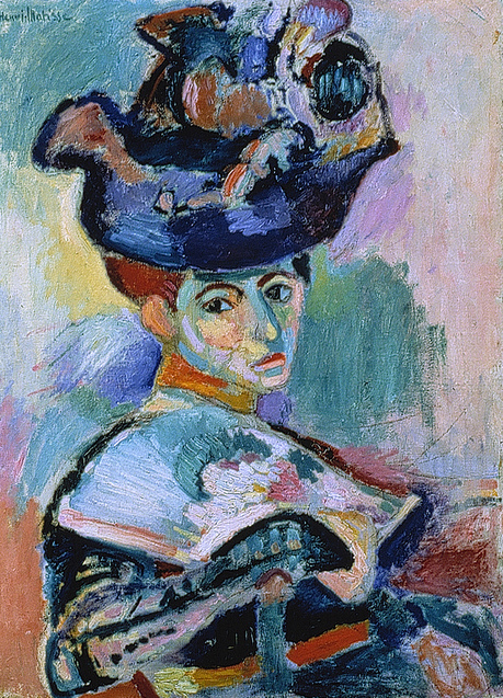
In that photo, you can see both Henri Matisse's Woman With a Hat (1906, oil on canvas) and Picasso's portrait, Gertrude Stein (1905-06, oil on canvas) which Gertrude said didn't look like here. Picasso's response: "Don't worry it will." He was right. Both works (shown here) were on display at SFMoMA.
If you're still reading this post, you're thinking one of two things: "When will it ever end" or "That's an awful lot of retail-art-museum coincidences happening in San Francisco." If you're thinking the latter, there's even more to come. Because on my last day in San Francisco, I paid a visit to the Contemporary Jewish Museum to see a show called, Seeing Gertrude Stein: Five Stories (also on view through September 6). This show explores five facets of Stein's life, from her avante-gard writing to her many friendships with some of the world's most creative thinkers.
Two of the "stories" told in the exhibit stood out for me. The first was Gertrude Stein's relationship with Alice B. Toklas. The two women were one of the first openly lesbian couples to take the world stage. With surprising candidness, they built a home life together that I found charming for its strange and quirky normalness. Photos of the two at home with their dogs Basket and Pepe, surrounded by art and intriguing objects like a pair of Louis XV chairs upholstered in needlepoint created by Alice, were a happy surprise. And their talk of being "married" made me realize that same-sex marriage has been an issue for a lot longer than I imagined. You can celebrate the progressive couple by downloading your very own Gertrude Stein and Alice B. Toklas paper dolls.
Here's Man Ray's photo, Gertrude Stein and Alice B. Toklas (1922, gelatin silver print).
The second "story" that intrigued me was the influence Gertrude Stein has had on the art world, and not just because she helped new art thrive in her own time. Even now, artists are creating works that embrace the ideals of individuality set out by Gertrude Stein. One of the most amazing pieces in the show is Devorah Sperber's After Picasso (2006, 5,024 spools of thread, stainless steel ball chain and hanging apparatus, clear acrylic viewing sphere, metal stand). I can only imaging that this reworking of Picasso's portrait of Stein would appeal to Toklas, with it's nod to the wonders of hand-crafted objects created from thread.
I'm always trying to figure out who the new, mainstream fashion retailers will be. With Salt Lake City getting an H&M (which means they've basically become EuroGap), I've been on the lookout for the new, hip global retailer. And I may have found it in the Barcelona-based brand, Desigual. Unlike other emerging (at least in the US) fashion brands like the UK's Superdry and Japan's Uniqlo which take a decidedly American-sportswear approach to fashion, Desigual brings an un-apologetically Spanish attitude, with lush patterns and sun drenched colors. Desigual was one of my first discoveries on this trip to San Francisco. But why would that matter for a post about museum visits. Because strangely, one of my next visits was to a museum show all about Spanish fashion.
Balenciaga and Spain is the de Young's recently-opened show that tracks the influence of Spanish art and culture on the brilliant haute couture of Cristobal Balenciaga. After having recently seen the spectacular Alexander McQueen show at the Met, I was worried this show would feel like a bunch of frumpy, old frocks. But Balenciaga was breaking rules and creating mind-blowing dresses long before McQueen was even born. And while this show wasn't presented with the attention to drama that I enjoyed at Savage Beauty, it was still brilliantly curated. (Note: I'm stealing photos from the web because pictures weren't allowed from the show. So these pictures do not represent installation views.)
Take for example, the way the exhibit demonstrated the influences of 18th and 19th Century paintings by Spanish artists like Velazquez and Goya. The billowing, draped silk felt positively royal, both in the paintings and on the mannequins.
Balenciaga also embraced two contradictory philosophies of Spanish Catholicism: opulence and austerity. Who wouldn't love a painfully plain creation designed for an important moment in life like Wedding Dress and Veil from the 1968 summer collection (white silk satin organza, silk gazar by Abraham).
This brings me to one of my favorite things about the show. Sure there were lots of lavish ruffles, intense beading, and impossible embroidery, but the best dresses were those with a stunning modernity, many almost architectural in their execution. This doesn't mean they didn't take their references from Spanish art. Balenciaga embraced many of the more challenging artists of his time like Pablo Picasso and Joan Miro.
One of my favorite dresses was shown next to a reproduction of a Miro painting that inspired it. Cocktail Dress (Winter 1967, black silk gazar by Abraham, rhinestones, faux pearls) was so far ahead of its time it feels like a silhouette Lady Gaga might rock on the red carpet.
Another favorite dress that hinted at the work of Picasso was this Evening Dress (Winter 1967, lime-green silk gazar by Abraham).
Wouldn't it be great if you could walk out of a show about early Modernist Spanish fashion and see a show about early Modernist Spanish painting? Oh wait, I'm at the de Young, and if I toddle downstairs, I can experience an entire exhibit dedicated to the greatest Spanish master of Modernism, Pablo Picasso. The show is titled Picasso: Masterpieces from the Musee National Picasso, Paris. And it's an ambitious effort. I've never been a big fan of early Modern art and I frequently don't get Picasso. This show did a whole lot to change my mind. If you go, get the audio tour which is packed with more information than you might want when it comes to Picasso.
What I didn't expect from this show? The raw emotions inspired by some of the art. In the first gallery is La Celestina/The Woman with One Eye (1904, oil on canvas). This picture of a poor woman with a severe cataract is from Picasso's blue period. That phrase used to make me giggle because it's so art-world silly. But the de Young show makes it seem more logical and provides a framework from which to better-understand the phases of Picasso's career. La Celestina is down right creepy. It packs a lot of emotional punch.
I also loved one of the final galleries in the show that featured five bronze sculptures all inspired by the same Picasso mistress, Marie-Therese Walters. It was fascinating to see Picasso present the same person in so many different ways, from relatively-true-to-the-original to abstractly cubist. Shown here is Head of a Woman (1931, bronze).
So far, the San Francisco trip seems to be all about Spain and Modernism. But maybe that theme could visit other European icons, like Paris. Because the next day we showed up at the San Francisco Museum of Modern Art (SFMoMA) with absolutely no knowledge of what was showing. The helpful woman at the membership desk asked if we were there to see the "Steins" show because it required timed tickets. I had no clue what the "Steins" show was, but based on the recommendation of the attendant, we got our tickets.
The official title of show is The Steins Collect: Matisse, Picasso, and the Parisian Avante-Gard (on view through September 6). The Steins were a prominent San Francisco family whose three children grew up and moved to Paris. The most famous of the group is writer Gertrude Stein. She lived for much of her early time in Paris with her brother, Leo. Also living in Paris at the time was another sibling, Michael Stein who lived with his wife, Sarah. The Steins were early champions of some of the greatest artists of the early 20th Century, including Picasso.
This exhibit is a stunning study in how to collect art, even if you have limited resources. The Steins seemed to have a sixth sense about the art and artists that would be famous down the road. In fact, some have argued that Gertrude Stein is partially responsible for Picasso's success as an artist. The Steins owned many of the most famous works by Picasso, Matisse, Cezanne, and others. Not only that, but they and their family members were regularly painted by these same artists. And when these artists became famous and were too expensive for the Steins to collect, they moved on to other emerging artists, helping to create a generation of successful painters, sculptures, and writers.
The Steins regularly opened their homes to anyone interested in the new art, hosting parties for not just the rich and famous, but also the casual visitor to Paris. Those gatherings were seminal in creating the innovative art scene that invaded Paris. While much of the art in this exhibit is impressive, the show is most interesting for the way it ties the art to the lives of the Steins. The Steins displayed their art salon style. The exhibit shows many early photographs in the homes of the Steins. You could see a work of art hanging on a wall in the photo, and then see the exact same work hanging on the wall of the museum.
Here's a photograph of Gertrude and Leo Stein's atelier at 27 rue de Fleurus.
In that photo, you can see both Henri Matisse's Woman With a Hat (1906, oil on canvas) and Picasso's portrait, Gertrude Stein (1905-06, oil on canvas) which Gertrude said didn't look like here. Picasso's response: "Don't worry it will." He was right. Both works (shown here) were on display at SFMoMA.
If you're still reading this post, you're thinking one of two things: "When will it ever end" or "That's an awful lot of retail-art-museum coincidences happening in San Francisco." If you're thinking the latter, there's even more to come. Because on my last day in San Francisco, I paid a visit to the Contemporary Jewish Museum to see a show called, Seeing Gertrude Stein: Five Stories (also on view through September 6). This show explores five facets of Stein's life, from her avante-gard writing to her many friendships with some of the world's most creative thinkers.
Two of the "stories" told in the exhibit stood out for me. The first was Gertrude Stein's relationship with Alice B. Toklas. The two women were one of the first openly lesbian couples to take the world stage. With surprising candidness, they built a home life together that I found charming for its strange and quirky normalness. Photos of the two at home with their dogs Basket and Pepe, surrounded by art and intriguing objects like a pair of Louis XV chairs upholstered in needlepoint created by Alice, were a happy surprise. And their talk of being "married" made me realize that same-sex marriage has been an issue for a lot longer than I imagined. You can celebrate the progressive couple by downloading your very own Gertrude Stein and Alice B. Toklas paper dolls.
Here's Man Ray's photo, Gertrude Stein and Alice B. Toklas (1922, gelatin silver print).
The second "story" that intrigued me was the influence Gertrude Stein has had on the art world, and not just because she helped new art thrive in her own time. Even now, artists are creating works that embrace the ideals of individuality set out by Gertrude Stein. One of the most amazing pieces in the show is Devorah Sperber's After Picasso (2006, 5,024 spools of thread, stainless steel ball chain and hanging apparatus, clear acrylic viewing sphere, metal stand). I can only imaging that this reworking of Picasso's portrait of Stein would appeal to Toklas, with it's nod to the wonders of hand-crafted objects created from thread.
Labels:
Alice B. Toklas,
art,
Balenciaga,
de Young,
Desigual,
Gertrude Stein,
Matisse,
Museums,
Paris,
Picasso,
San Francisco,
SFMoMA,
Spain
Thursday, July 21, 2011
What I learned at Storm King: Steel is fluid.
Yes, I'm still talking about the amazing things I experienced at the Storm King Art Center. But I can't leave the topic without mentioning a couple of other sculptures. These two Zen-inducing works are made from steel. But with just a slight breeze, the metal sculptures drift and glide effortlessly, transforming sculpture into something magical.
Here is Five Open Squares Gyratory Gyratory (1986, stainless steel) by George Rickey.
And this is Sea Change (1996, stainless steel) by George Cutts.
Here is Five Open Squares Gyratory Gyratory (1986, stainless steel) by George Rickey.
And this is Sea Change (1996, stainless steel) by George Cutts.
Tuesday, July 19, 2011
Book seventeen: Thirteen Reasons Why by Jay Asher.
Teen angst and high-school drama reign supreme in Jay Asher's Thirteen Reasons Why. My opening statement may come across a little flippant for a book about teen suicide. But I wasn't good at all that drama when I was in high school. And I find it less interesting now that I'm older and less willing to blame others for everything.
Here's the idea behind Thirteen Reasons Why: Clay Jensen (one of the narrators in the book) receives a box of cassette tapes. He tracks down a cassette player and discovers that the tapes were created by Hannah Baker (the other narrator in the book). Hannah was a "new girl:" in school who was tormented by her classmates and in response commits suicide. But before killing herself, she makes a series of cassette tapes that identify people who factored into her suicidal decision. There are thirteen people identified and the tapes are to be passed along to each person. If they aren't passed along, Hannah has diabolically arranged for a secret, second set of tapes to be made public.
I did a fair amount of eye-rolling while reading this book. Hannah would build up the tension and suspense as she neared revealing the next person who ruined life, only to divulge some trivial rumor or the fact that someone hadn't tried hard enough to get her to talk about how she was feeling. Sure there were a few moments that were serious or emotional. But for the most part, this is a book about making mountains of molehills.
By the time I finished the book, I didn't really feel sorry for anyone. I didn't feel sorry for the people identified in the tapes because most of their "crimes" seemed so inconsequential. I didn't feel sorry for Clay (who had a crush on Hannah) because he was the one character who treated Hanna with respect. And most important, I didn't feel sorry for Hannah, hell I didn't even really like her. And that's a problem for a book like this. Because I really wanted to feel like Hannah had been treated in a way that warranted her actions. And I just didn't.
I know, I know, high-school bullying is a big problem right now and this delivers the message that even small insults can cause immense emotional harm resulting in tragic ends. That's a good message that needs to be told. But here's another message that needs to be told: High school sucks. Get over it! Now let's move on to the things that will really make your life meaningful.
P.S. As with book fourteen, you've just read the commentary of a 40-something realist (some might say cynic). A whole lotta high-school students (and their parents) would disagree. So lest I discourage you from reading a book that might save a teen's life, consider reading others' opinions about Thirteen Reasons Why.
Here's the idea behind Thirteen Reasons Why: Clay Jensen (one of the narrators in the book) receives a box of cassette tapes. He tracks down a cassette player and discovers that the tapes were created by Hannah Baker (the other narrator in the book). Hannah was a "new girl:" in school who was tormented by her classmates and in response commits suicide. But before killing herself, she makes a series of cassette tapes that identify people who factored into her suicidal decision. There are thirteen people identified and the tapes are to be passed along to each person. If they aren't passed along, Hannah has diabolically arranged for a secret, second set of tapes to be made public.
I did a fair amount of eye-rolling while reading this book. Hannah would build up the tension and suspense as she neared revealing the next person who ruined life, only to divulge some trivial rumor or the fact that someone hadn't tried hard enough to get her to talk about how she was feeling. Sure there were a few moments that were serious or emotional. But for the most part, this is a book about making mountains of molehills.
By the time I finished the book, I didn't really feel sorry for anyone. I didn't feel sorry for the people identified in the tapes because most of their "crimes" seemed so inconsequential. I didn't feel sorry for Clay (who had a crush on Hannah) because he was the one character who treated Hanna with respect. And most important, I didn't feel sorry for Hannah, hell I didn't even really like her. And that's a problem for a book like this. Because I really wanted to feel like Hannah had been treated in a way that warranted her actions. And I just didn't.
I know, I know, high-school bullying is a big problem right now and this delivers the message that even small insults can cause immense emotional harm resulting in tragic ends. That's a good message that needs to be told. But here's another message that needs to be told: High school sucks. Get over it! Now let's move on to the things that will really make your life meaningful.
P.S. As with book fourteen, you've just read the commentary of a 40-something realist (some might say cynic). A whole lotta high-school students (and their parents) would disagree. So lest I discourage you from reading a book that might save a teen's life, consider reading others' opinions about Thirteen Reasons Why.
Subscribe to:
Posts (Atom)


