Sunday, April 15, 2012

Post-apocalyptic museums and the art of photography.

My global museum adventure continues with a stop in Berlin.  The only free time we had in Berlin was on a Monday, not a good museum day since just about everything was closed.  Fortunately, Claudia from the local production company found at least one open museum; the C / O Berlin.  I'm a little glad this was the only open museum I could find, because I don't think I would have chosen this from all the Berlin museums available and it proved to be a museum experience like none other.

What makes this museum special? A couple of things.  First, it's a well-respected organization that focuses on showcasing the world's best photographers.  And judging by the posters that line the entry way, this museum has seen exhibits by just about any one who's anyone in the world of photography. But the thing I found most intriguing about C / O Berlin was the setting.  The museum is housed in an old building that looks like something from a post-apocalyptic movie.  And the management has done little to change that impression.  With hallways that have peeling paint, chipped walls, and floors that may be a little too original.


Against this backdrop of urban decay, the curators lovingly present some of the world's best photographs either on elegant, free-standing walls or directly on the weathered walls.  One of the museum's gallery was once a gymnasium.


While I was there, two interesting photo exhibits were on view, both with photographs from photographers I was unfamiliar with.  First up is Arnold Newman: Master Class. Newman, who died in 2006, studied to be a painter.  He interrupted his education for financial reasons and became a portrait photographer at a department store.  He eventually became a fine Art portrait photographer, particularly with his series of photographs of famous artists.

I was in Berlin as part of a photo shoot for one of my clients.  Most of our photographs involved portraits of people in working environments.  Arnold Newman made me want to be a better creative director as many of his photographs were exceptional.  I loved Dr. Edwin H. Land with group of Polaroid employees, Polaroid warehouse (1977, gelatin silver print).


David Rockefeller, Businessman (1962, gelatin silver print) is a stunning photo with exceptional composition. You can feel the power of money looking at this picture.


Andy Warhol, painter and printmaker in his studio (1973, gelatin silver print) demonstrated Newman's willingness to present photography in surprising ways.


Also on view was an ongoing series of exhibits designed to showcase young, up-and-coming photographers. Talents 26: Lost and Found features the photography of chinese artist Peikwen Cheng with the assistance of Eileen Seifert. It's almost become a cliche for photographers to go to Burning Man in an effort to capture amazing images.  In fact I almost rolled my eyes when I read that this was the theme of Cheng's images.  But Cheng changed my mind. His digitally-unaltered images are haunting. With prints large enough to overtake your vision, this exhibit was like walking into a dream.   And it seemed to continue the museum themes that started in Toronto.  Here are a few of my favorites from the show:

Journey Together

Launching out of Oblivion

Love is . . . 

Lamp Mobile

Thanks Berlin for a great day at the museum.

Saturday, April 14, 2012

Dreaming in Toronto.

My last post from the Art Gallery of Ontario (AGO) acknowledged themes of memory and dreams that seemed to infuse the museum's permanent collection of Modern and Contemporary Art. But those same themes were alive and well elsewhere in the museum.  Take the temporary exhibit Jack Chambers: Light, Spirit, Time, Place and Life. I was not familiar with the work of this Canadian artist. Over the course of his career, the artist developed a hyper-real style he called "Perceptual Realism." The process involved taking pictures of his family, home, and favorite places.  Then carefully rendering those images in paint.  The results are images that feel like the old, faded color photographs of my childhood. And just like those old photographs, these paintings inpsire  emotions that serve as a reminder life is really just a collection of memories we curate until we die.  I liked these painting very much.  Here are a few examples:

Diego Reading (1976-1977, oil and synthetic paint in natural resin varnish on plywood).

Sunday Morning No. 2 (1968-1970, oil on wood).

I forgot to record the title of this painting, but I love the sleeping boy and the toy Gorilla.


Also of interest at AGO is the Thomson Collection, originally amassed by Kenneth Thomson and now housed permanently at the museum. There are so many things to see at the world's museums that I believe in focusing my time to explore the things that interest me most; usually modern and contemporary art. I seldom get interested in Old World collections.  But the Thomson Collection is like nothing I've ever experienced.  The objects that most interested Kenneth Thomson were small, precious items frequently made from natural materials.  And there are hundreds of tiny, intriguing curiosities from Medieval enamel and ivory works to Renaissance rosary and prayer beads. There are collections of Chinese snuff boxes and Baroque boxwood and ivory sculptures.  The displays go on and on.

I have to commend the curators at AGO for staging some of the most beautiful exhibit cases I've seen.  It starts with the cabinet of curiosities that greets you at the entrance to the galleries. This gives you just a taste of the thousands of items that will confront you inside the galleries.


This amazing wall of ivory busts is just one of many such overwhelming displays of collections.


And Mr. Thomson loved skulls and skeletons.  There many collections that featured skulls.  I loved this small ivory sculpture of a cherub resting on a skull.


This is the first time in a long time when I wished I had left more time to explore the old European collections of a museum.

Before finalizing my experiences there are a few other things to mention.  First, my new favorite museum perk: the folding gallery stool.  All over AGO were discreet racks that held small, easily-carried stools.  So that you could plop down in any gallery and enjoy the art.


When museum visits involve so much walking, it sure is nice to have a few moments to rest and contemplate what you're looking at.  I wish more museums had these.

Finally, I can't end my memories of AGO without showing one more element of Frank Gehry's inspiring architecture.  I loved this soaring gallery lit with natural light.  It just happened to be empty during my visit but that may have made it even more beautiful.


Tuesday, April 10, 2012

Not long AGO in Toronto.

Work recently took me on a trip around the world. And while our schedule was incredibly tight, I still made time in each of three cities to visit a local museum.  The first city on my trip was Toronto, Canada.  I started my global museum adventure at the Art Gallery of Ontario (AGO). One of the reasons I chose to go to the AGO is that we had shot photography near the outside of the building a few days before.  This is an old museum with a recent addition designed by Frank Gehry.  The exterior winding staircase had me curious as to what it was like inside.  Here's the outside staircase:


And here's what it looked like on the inside:


The closer you got, the more intriguing the staircase became.


It's not just the architecture that makes this building interesting.  There are a number of works of art that made the visit enjoyable.  It's always fun to find an exhibit that features an artist from the museum's native country, particularly when it's someone I'm not familiar with.  In this case it was Canadian artist Iain Baxter&. No that's not a typo. In 2005 the artist legally added the ampersand to his name. My favorite works of his involved vacuum forming plastic around ordinary household items.  These works from the 60s have a Pop-art vibe that feels true to the artist's later concerns for the environment. Here are Still Life with Six Colors and Still Life: Two Plastic Bottles (both 1965, acrylic on vacuum-formed plastic).


The "plastic" theme continued in the AGO's permanent collection of Modern and contemporary Art with a whimsical piece by Les Levine.  Plug Assist #2 (1966, vacuum-formed Uvex) makes you want to vacuum form your entire house.


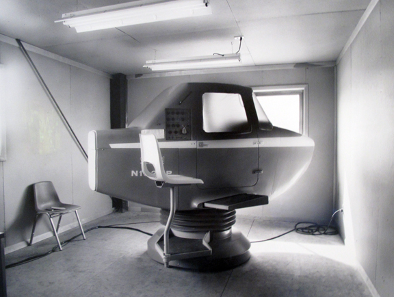
The surreal nature off this plastic work continued with Lynne Cohen's dreamy black and white photographs which feel like they come from another time and place.  Dreamy imagery would prove to be a theme at this museum with a number of works that explored and provoked notions of memory.  I love the strange reality of Flying School and Recording Studio (both 1989, gelatin silver print).


Younger (2004, pony beads, synthetic hair, aluminum hardware) is a scene from Kori Newkirk's childhood dreamily rendered in unexpected materials. I find myself thinking about memory a lot these days.  This work adequately expresses the way my memories have blurred over time.


No one does dream-like images better than Gerhardt Richter. I can't figure out how he can make a blurry image seem so photo realistic. This is Scheune/Barn No. 549/1 (1983, oil on canvas).


My favorite work about the fleeting nature of memories was by an artist I've followed for some time.  I've seen a number of Do-Ho Suh artworks in person but never one of his signature fabric structures.  I was surprised to see one in Toronto.  In response to a longing of familiar places of the past, Suh creates portable, fabric versions of living areas such as his childhood Korean home.  348 West 22nd St., Apt. A, New York, NY 10011 (Bathroom) (2003, nylon, silk fabric, steel framework) is a full-size replica of the bathroom in his New York apartment. The result is mesmerizing beauty.


There was more to see at the Art Gallery of Ontario but I'll save those stories for another post. However I can't end this post without one more photograph of Frank Gehry's beautiful addition.


Friday, March 30, 2012

Book thirty-five: The Sense of an Ending by Julian Barnes

Let's talk about time.  I'm constantly wondering about time; and by time I really mean memory; all those stories I remember from my past; those stories that I can't confirm, that I'm unsure about, that I wish I could confirm. I've spent a lot of time lately trying to confirm my memories, interviewing my parents and others to figure out if my memories match the those of others.

With that in mind, let's talk about this year's Man Booker prize-winner, Julian Barnes and his winning novel, The Sense of an Ending.  This is a book about time and memory and how we all remember things differently.  It's also a story about what happens when we are confronted with the reality of the past.

I have no intention of even hinting at the characters or the plot or the action that makes this novel work.  I'm convinced this is a book best read with as little advance knowledge as possible.  But it's definitely a book worth reading.  It starts with a list of vague memories.  Then, as you read the book, each of those listed memories returns to inform the tale and remind characters that time may or may not heal.


Friday, March 9, 2012

MAD about Korea.

Sure I went to the Museum of Arts and Design (MAD) for the strangely beautiful show featuring dust, dirt, and ash. But as is often the case, I discovered another show that may have been even more rewarding. That show was Korean Eye: Matter and Energy. You hear about how Chinese artists are taking over the Art world. But if this show has anything to say about the matter, Korea shouldn't be written off.

Here are a few of the works I liked.  Let's start with the piece that greets you as you step off the elevator, Ji Yong Ho's Bullman 4, 2010 (Synthetic resin, steel, used tire). This work is brilliant for its bold attitude and immense strength.


Kang Hyung Koo offers a strange and startling painting, Woman, 2008-2009 (Oil on aluminum). I can't really call this portrait photo-realistic because the eyes are too ethereal. It's a beautiful work that had me staring.


Strange portraits seem to be a popular with the Korean Art crowd. How about this opulent, magical work by Kim Hyun Soo: Breik, 2008 (Epoxy, human hair, oil color, steel, watercolor). I have to believe the curators saw the lovely synergy between this work and Bullman 4.


One of my favorite works was Lee Leenam's Ming and Chung Dynasty Paintings - Cross Over, 2011 (LED TV).  This work uses five LED monitors to recreate the panels of a traditional Asian screen. Only these panels feature subtle animations that allow the scene to cycle through all four season. In just four minutes, you can experience the seasons of an entire year. This picture can't possibly do the work justice.


Finally, I have to send a big shout out to Bahk Seonghi for his mind bending work Point of View 1110, 2008 (Coloring on mixed media).


The work is most amazing when you realize that it is a brilliant exploration of perspective.  Here's what the work looks like from the side:


Once again, MAD has drawn my attention to Art that that I probably wouldn't have considered otherwise. And the experience was inspiring. But not just inspiring, it was some pure Art-world fun. Unfortunately, the show closed shortly after my visit. So you'll have to look elsewhere to get your Korean Art fix.

Wednesday, March 7, 2012

Art gets dirty. And dusty. And maybe cremated.

I like the curators at New York's Museum of Arts and Design (MAD). They have a penchant for organizing exhibits which look for art in unlikely materials.  In 2009 there was Slash: Paper Under the Knife with it's astounding paper works. 2010 brought Dead or Alive, an exhibit that featured art created from the products of living organisms. And currently on exhibit is Swept Away: Dust, Ashes, and Dirt in Contemporary Art and Design. Once again the curators at MAD have created an intriguing show fabricated from the unexpected.

It's easiest to show some of the work. Here's Catherine Bertola's mystical installation titled Unfurling Splendor (Adaptation IV), 2012. It's made of PVA glue and dust applied to the walls of the museum.  The result is a strange, almost  tragic view of our collective histories.


And how about Chinese artist Zhang Huan's Ash Army No. 1, 2008 (Ash, Steel, Wood). Zhang uses incense ash to create these sculptures. That may not have the impact here in the U.S. that it does in countries where temples are filled with incense (and the resulting ash) lit by people praying for a variety of  personal desires.


I loved Phoebe Cummings The Delusion of Grandeur, 2011 (Raw Earth and Wood). Cummings uses basic clay from the earth to create immensely detailed sculptures that are extremely fragile and will ultimately crumble, only to be remembered through photographs. This work is hauntingly beautiful and painstakingly displayed by the curators at MAD.


Also on view are several works by Jim Dingilian who takes old liquor bottles and paints the insides with a number of materials including smoke. His scenes are mostly contemporary, giving these works a strange, modern take on something that feels old and from a place far, far away.


As a big fan of Vic Muniz, I can't not talk about his large scale photos of even larger scale earth works. and his massive earthworks, and it's not just because he references Robert Smithson. They're works that remind us how much damage we humans do to the earth. But at least these works offer damage with a sense of whimsy.


There are plenty of other works to see at this well-thought show. You can see it now through August 12, 2012.


Monday, March 5, 2012

Seeing spots.

If you pay any attention to the Art world, you've likely heard about the brouhaha that arose from Damien Hirst's most recent Art-world stunt. That stunt involved taking over every Gagosian gallery around the world which includes four New York City locations, two London locations, and galleries in Paris, Rome, Athens, Geneva, Hong Kong, and La Jolla. The show is called Damien Hirst: The Complete Spot Paintings 1986 - 2011.

By pure Art-fan luck, I was able to see one of the shows at the Gagosian gallery on West 21st street in New York City. This is one of those moments when I have to question Art. I'm pretty sure that Larry Gagosian and Damien Hirst have just foisted one of the greatest scams ever foisted on the world of fine Art. Before you write off my criticism, you should know that I'm a big fan of much of Hirst's work.  With other artists like Jeff Koons, Marc Quinn, and Tom Friedman, I think Hirst is an important voice in a new wave of artistic ideas.

But the spot paintings?!? Really!?! These are canvases (as well as a bunch of editioned prints) that are almost exclusively painted by anyone other than Hirst. He has an army of assistants that have been painting spots for months in preparation for this P. T. Barnum-like event. In fact, it's unsure how much involvement Hirst has even had in the direction of how the paintings should be made. Don't get me wrong; I love the graphic design of these paintings.  Walking into the Gagosian Chelsea gallery and confronting these massive canvases is a wildly pleasing experience.  The paintings play tricks on your eyes. From the tiny spot paintings to the overwhelming canvases that overtake your vision, these paintings delight, particularly for someone like me who loves repetition with surprising variations. But these paintings are more graphic design than they are fine Art.

I imagine that Damien Hirst's spot paintings will accomplish what many Pop artists before him were able to accomplish; they'll offer a slew of simple-to-create works that just about every museum and gallery on the planet will acquire. That's right, I'll be surprised if a few museums here in Utah aren't able to pick up a painting or a print from the spectacle. They won't come cheap, either. Larry and Damien will make a pretty penny off of this scam. And once every museum on the planet has a spot painting, Damien Hirst will have ensured his place in art history, because no museum will be willing to criticize his work (even his "spotty" work) if they have a spot painting in their permanent collection. It's a shrewd (if not cowardly) way to make the history books.  You've seen this same trick performed by many Pop artists, most notably Andy Warhol.


But wait, what if I'm wrong.

Now that you know how I feel about all these spots, I should admit that I can also defend the work. Here's the problem, any time an artist does something repeatedly for an extensive period of time, it's worth taking a closer look.  Damien Hirst has been making his spot paintings for twenty-five years. It's obvious he's trying to make a point (or would that be a spot).

Rumor has it that some of the early spot paintings weren't just created by armies of assistants but also by colleagues and friends. If that was happening in 1986, just as the internet was romancing the public, Hirst may very well have been ahead of the curve on a cultural meme that has led us to the interconnected society we live in today; where thousands of people from around the world can come together and accomplish wondrous things. Maybe all those spots say something about who we were at the end of the 20th Century.

I also wonder if the spot paintings may relate to the general themes of Hirst's art. Death is often sited as the central idea of Hirst's work. But I like to think of his art as being more about soul, or maybe the lack there of. In a time when many are asking questions about the soul of the Art world; a time when it's easy to think that Art is no longer about real ideas but just about art dealers, and collectors, and museums, and the millions of dollars that are more about greed than about Art. Maybe at a time like this, artists should be asking questions about the soul of Art. And if you remove the soul from Art, you might very well end up with a bunch of spots. So I can argue that this is just a giant prank. But maybe this is Damien Hirst asking us to ponder the state of the Art world.

Whatever your feelings are about The Complete Spot Paintings 1986 - 2011, you have to admit Damien Hirst knows how to stir the Art-world pot. And I suppose, that's what artists are supposed to do.