Friday, September 27, 2013

More eye-straining art at the Grand Palais.

As promised, this is my second post about my trip to Paris's Grand Palais to see Dynamo: A Century of Light and Motion 1913 - 2013. You can read the first "Vine video" post here.  In this post, I'm featuring  static pictures instead of videos. I'll try and write less and show more pictures. Once again, I've grouped works into categories.

The black and white of op art.
Many of the works in this show were limited to just two colors: black and while. Limiting color doesn't mean you can't achieve impact.  From one of the earliest pieces in the show by Henryk Berlewi to later works that more forcefully embraced op art as a way to play with perception, black and white can be a powerful color scheme.

Henryk Berlewi, Kontrasty Mechanofaktur, 1924, Gouache on paper.

Victor Vasarely, Metagalazie, 1959-1961, paint on canvas.Victor

Victor Vasarely, Vega-Bas, 1967, paint on panel.


The power of color.
Dynamo showcased color in several amazing ways.  One of my favorite works was Chromosaturation by Carlos Cruz-Diez. The walls of these maze-like rooms were so precisely lit, that the rooms themselves became big blocks of color, more emotionally powerful than you might expect.  It also did strange things to perception of color.

Carlos Cruz-Diez, Chromosaturation, Paris, 1965, Fluorescent Tubes, Lee filters, aluminum, acrylic paint medium.

Carlos Cruz-Diez, Chromosaturation, Paris, 1965, Fluorescent Tubes, Lee filters, aluminum, acrylic paint medium.

Julio Le Parc, Surface Couleur - Serie 14-2E, 1971, acrylic on canvas.


When lines collide.
I can't believe what you can accomplish with just a simple line.  These works are stunning for their simplicity.  But also for their ability to really screw with your vision.

Francois Morellet, 4 Doubles Trames, 1958, oil on canvas.

R.H. Quaytman, Distracting Distance, Chapter 16 (RGB), 2010, silkscreen and gesso on wood

Evariste Richer, Slow Snow (Day Snow/Night Snow), 2007, acrylic on canvas.

Michael Scott, Sans Titre, 1989, email on aluminum

Philippe Decrauzat, Shut and Open at the Same Time, 2008, paint on wood. Installation view with Mirrors, 2013, stickers.


The art of reflection
In my previous post about Dynamo, I mentioned that seeing one's self in art is powerful.  These works prove that to be true. While I may appear to be up-side-down in some of these photos, It's actually because the art works and their strange lens-like qualities distort reality; or do they simply reveal reality.

Le Prisme by Nicolas Schoffer was a dizzying window that opened onto an endless kaleidoscope, making the viewer feel like the walls of the Grand Palais were hollow and filled with magical light.

Nicolas Schoffer, Le Prisme, 1965,
I'll take a work by Anish Kapoor any day.  His intense use of color and reflection captivate the viewer and force moments of self reflection. The fact that they frequently create instant, constantly changing abstract works of art  just makes them all the more intriguing.

Anish Kapoor, Untitled, 2008 Aluminum Lacquer.

Anish Kapoor, Untitled, 2008, Aluminum Lacquer.

Anish Kapoor, Islamic Mirror, 2008, Stainless Steel


Yayoi Kusama is famous for her spots, usually rendered in bright colors and painted on everythig from pumpkins to spindly tenticles.  Here they covered the walls of a precisely constructed museum-gallery maze. Reflective domes covered with more reflective domes created a world where every museum visitor was repeated endlessly.  It was like a strange art-world quantum physics universe.

Yayoi Kusama, Invisible Life, 200-2011, Acrylic mirrors and recessed spotlights.


Basking in the glow
Some of the masters of light were on view in Paris. Dan Flavin's minimalist and structured fluorescent tubes were brilliant for their ability to transform a gallery and everyone in it. Neon also made a big showing.
Dan Flavin, Untitled (to you, Heiner with Admiration and Affection), 1973, Fluorescent Tubes.


Francois Morellet, Triple X Neonly, 2012, Blue Neon Tube and 2 Transformers.

Francois Morellet, Triple X Neonly, 2012, Blue Neon Tube and 2 Transformers.

Robert Smithson, The Eliminator, 1964, Replicated in 2013, Steel, glass, and neon.

Perception is certainly not reality.
I'll close with one of my favorite works in the show. Felice Varini's Vingt-trois disques evides plus douze moities et quatre quarts (2013, orange acrylic paint on adhesive foil) was mind-blowing.  I first experienced it entering the main hall of the Grand Palais. We were there for a completely different event.  I didn't know it was part of the Dynamo exhibition and assumed it was an abstract, rather perplexing series of random splashes of paint splattered across the front of the building; probably done by some street artist who's made it big in the fine art world.  It made little sense to me but hey, we're talking contemporary art here, so I processed it and moved on.

It wasn't until the following day, after having purchased my ticket to Dynamo that I was wandering through the galleries and the reality of these orange splashes locked into view.  As you stepped through a door onto a patio, all those random shapes created a perfect pattern. I love that the view almost didn't seem real.  It's almost as if someone used Adobe Illustrator to add the pattern afterwards.  And it didn't feel like that just in the flat photo you see here.  The effect was even more disorienting when you were standing in front of the image. It was pure art-world magic.  But maybe like many things in the contemporary world, it was enabled by technology, which would be appropriate considering the technological feeling than many of the works in Dynamo embraced.

Felice Varini's Vingt-trois disques evides plus douze moities et quatre quarts, 2013, orange acrylic paint on adhesive foil

Felice Varini's Vingt-trois disques evides plus douze moities et quatre quarts, 2013, orange acrylic paint on adhesive foil

Felice Varini's Vingt-trois disques evides plus douze moities et quatre quarts, 2013, orange acrylic paint on adhesive foil

Sunday, September 22, 2013

Blinded, warped, and surprised at the Grand Palais

Many of the art stars of the 20th Century made their careers by embracing abstraction. The painters are the most well known.  But a summer exhibition at the Grand Palais in Paris shows that many of the most interesting abstract artists worked in and continue to work in non-traditional mediums: namely light and motion.

Dynamo: A Century of Light and Motion 1913 -2013 is an epic exhibition that for me was less about light and motion, and more about the way we as humans perceive the world.  I've already mentioned that Parisians know how to curate and install ambitious exhibitions.  And this show was jaw dropping for its size, scope, and the ambitiousness of the installation.   The exhibition is big enough, that I've decided to write two posts: The other post will feature more traditional still photos.  This post will be my first ever Vine video post.  These six-second videos struck me as the perfect way to share the motion-driven experiences and the fun of the exhibit.

That brings me to my final point before I start talking about the specific work.  I like exhibits that ask you to consider new, difficult questions but that aren't just academic.  This exhibit delivered on this philosophy in a spectacular way.  While it was immensely thought provoking, it was also loads of fun.  And that's hard to achieve.

Here are a few of my favorite pieces, captured on Vine videos.  I've categorized them into themes and ideas that jumped out at me.  I apologize that in my awestruck state, I didn't capture the titles of some of these works.  I'll include them where I have them and will try to at least identify the artist when I don't.

Self Reflection
Seeing yourself in art in a literal way can be surprisingly powerful. Especially when that self morphs and moves in dizzying ways.  Dynamo represented an introduction for me to the works of Jeppe Hein who regularly works with mirrors that are set in motion.  Three works in Dynamo deliver different perception-shifting experiences, all from Hein. The first work is Rotating Labyrinth, 2007 and the second is Mirror Billboard, 2008. The third video features a work titled 360 Degree Illusion II.


A Flash of Emotion
There are numerous times during a walk through Dynamo when the curators warn visitors, particularly those prone to epileptic episodes, that the art on display may induce seizures.  Most of those artworks involve intensely flashing lights.  And you can see why they might affect our brains in such dramatic ways.  Even though I'm not prone to seizures, several of these works were unsettling and left me feeling unstable and unsure of the world around me.

The first work is John Armelder's Voltes III, 2004.  The second is Carston Holler's Light Corner which was overwhelming.  You could feel the heat radiating from the light bulbs. The third work is The Flicker, 1966 by Tony Conrad.  And the fourth is Slow Arc Inside a Cube IV, 2009 by Conrad Shawcross.


The illusion of movement.
Many of the works in Dynamo use simple devices that only come to life when you as the viewer move around the work.  Some of them were almost secretive about their offered illusions.  But once you discovered the trick, they were loads of art-world fun.

The first video is Cloisonne a Lanes Reflessichantes, 1966 by Julio Le Park followed by a second work from the same artist.  That third and fourth works are Double Metamorphose III 1968-1969 by Yaacov Agam and Instabilite No 3, 1962-1969 by Jean-Pierre Yvaral


The love of color.
Combine op art with a vast array of color and you get some surprising results that can be mesmerizing, playful, or even overwhelming.  In that last category is the third video in this grouping which was so disorienting  that I had a brief moment of terror realizing that I might not be able to find my way out. It was a room filled with artificial fog lit through colored filters.  The work is titled Daylight Blue, Sky Blue, Medium Blue, Yellow, 2011 by Ann Veronica Janssens.  The first video is Transchromie, 1975/2013 by Carlos Cruz-Diez and the second is Espaces Chromatiques, 1970 by Gregorio Vardenaga.


A surprisingly simple trick.
I'll end this post with one of my favorite works in the show. Beyond the Fans, 2013 by Zilvinas Kempinas is simple yet so delightful it made me want to be a kid again.  I love it when kids discover strange ways to use everyday objects to create largely useless, amazing results.  This piece, which uses fans to force two large loops of magnetic tape to float magically against a wall is the perfect embodiment of the childlike curiosity that permeates Dynamo. 


Tuesday, September 17, 2013

The bigger-than-life art of Keith Haring.

There was a lot of Keith Haring involved in my trip to Paris.  I've already posted about my visit to the Musee d'Arte Moderne for Keith Haring: The Political Line.  That exhibit wasn't confined to one location.  Some of the works included in the show are so big, they wouldn't fit in a traditional museum.  So we made the trip to the exhibit's second location in the 19th Arrondissement, a place where I doubt many tourists are likely to visit.  It's a working-class neighborhood where you'll find a venue called Le Centquatre. And there, was an exhibit of Keith Haring's work that was unbelievable for its scale. But before I get to the scale, a comment about smaller details; I loved the graffiti-like, spray painted signs (see inset photo) that could be found on walls everywhere directing visitors to the exhibit spaces.  Now, onto the exhibit.

The first thing you encounter upon entering the exhibit was a big surprise: Pop Shop Tokyo (Container), 1988, mixed techniques on wood and steel containers.  Keith Haring's two New York Pop Shop locations are legendary with the SoHo location open until 2005.  But less knows is his shop in Tokyo.  It was created using shipping containers.  And the actual container was on view at this show.  Wow! I just wish it was filled with all the cool paraphernalia that would have inhabited the shop in 1988.


In the large center area of Le Centquatre there was more than the Pop Shop Tokyo, there was also a collection of giant sculptures.  I've seen big Keith Haring sculptures but these were bigger than anything I've seen before.  They were brilliant. I particularly loved the massive dancing dog.  But the great thing about all of these sculptures is the joyful, playfulness of the works.  You can't help but have a great time surrounded by works like this.


Untitled (Dancing Dog), 1989, Polyurethane paint on steel A-36

Untitled (Head Through Belly), 1987, painted steel.

A massive sculpture in bright, primary colors was in the entryway to Le Centquatre and the creatures that make up the sculpture are positioned as if they're street dancing which was all too appropriate.  Because like the party after the exhibit at Musee d'arte Moderne, there were street dancers practicing here, giving a sense of 80s fun to the entire affair.  And making the sculpture even more vibrant.


The large areas of the Centquatre allowed for the exhibition of some extremely large works like the brilliant The Marriage of Heaven and Hell, 1984, acrylic on canvas.  I've seen photos of this work displayed in the past and almost always, it's been shown with part of the painting rolling onto the floor. But here there is enough room to show it hanging fully on the wall. Created as a curtain for a ballet of the same name, this work seems strangely relevant during a time when the debate about same-sex marriage rages.


The Marriage of Heaven and Hell, 1984, Acrylic on canvas.

But the real reason I made the trek to Le Centrquatre was to see Keith Haring's The Ten Commandments, 1985, oil and acrylic on canvas. These works, painted on 25-foot canvases are spectacular. I loved them for their graphic simplicity, their color, and their willingness to confront current issues. From greed, to cruelty, to hypocrisy, these paintings slap you in the face with their emotional strength. And the presentation at Le Centrquatre could not have been more powerful. Lit brilliantly in a dark space, the works gave a sense of religious reverence that silenced most visitors and left the rest of us whispering softly.  It was a decided change from the happy playfulness in the sculpture courtyard.  Once again, I was left standing in awe of Keith Haring's inspired emotion created with just the simple use of lines and color.


Sunday, September 15, 2013

Now that's how you curate a Keith Haring exhibit.

I'm no stranger to the art of Keith Haring.  I've been looking at his art since seeing one of the first major exhibits I ever saw twenty-something years ago.  It was an exhibit in Washington, DC that looked at the influence of Walt Disney on the art world.  From then until last year's inspirational Haring retrospective at the Brooklyn Museum of Art, Haring has been one of the artists I seek out.

So it's no surprise that I went out of my way during my first visit to Paris to get to the Musee d'Art Moderne for Keith Haring: The Political Line. What is a surprise, is how much this exhibit made me realize that there's a lot of Haring's work I haven't experienced.  It's easy to assume that Haring is all about "radiant babies" and "dancing wolves."   But this exhibit goes beyond the most famous of Haring's imagery and paints a more complex picture.

But before we get to all the politics, let's just talk about the objects.  The Political Line is an astounding achievement from a curatorial standpoint. And it includes one category of objects that I didn't even know existed; giant vases.  I'm not sure how I can have been to so many Haring exhibits without knowing there are all these massive vases.  I love how Haring's markings seem both ancient and modern.  Many of them feature nudity or sexual acts which only reinforces the idea that these are a modern nod to antiquity.  Of course boom boxes ensure you know these are works from the 80s. Here are a few photos of just a portion of the works included in the show:

Untitled, 1984 Ink on Terra Cotta

Both Untitled, 1981-82 Enamel and Ink on Fiberglass

Untitled (Tinaja), 1982-83 Acrylic on Terra Cotta

Detail from
Untitled (Tinaja), 1982-83 Acrylic on Terra Cotta

Untitled, 1985, Chinese Ink on Terra Cotta Vase

Both Untitled, 1989 Acrylic on Terra Cotta Vases    

The vases also made me realize that Haring is an artist who is all about scale.  His works are frequently gigantic and this show dedicates massive amounts of wall space to Haring's work. (Although part two of my Paris Haring experience will only make me realize that the vision of Haring's work can be even bigger than what was shown here.)  Two canvases were particularly large and engaging:

Untitled, 1983, Acrylic on vinyl cover

Untitled, 1985, Acrylic on canvas

All the above pieces weren't meant just to celebrate the objet d'art.  All the works in The Political Line were selected to demonstrate Haring's use of art to make idealogical and political statements. The show delivers in a massive way reminding the viewer that Haring's work is far from the happy, fun-filled images we all know and love.  Most of his work is surprisingly hard hitting as he tackles everything from religion to consumerism to sex.  That means much of his art was and is surprisingly controversial.

The exhibit tackles a number of themes in Haring's work. I'll mention a few, starting with fame and commercialism.  I know it seems a bit disingenuous that a Pop artist like Haring wants to complain about the perils of fame and commercialism when so much of what he did falls squarely within these two ideas.  He made plenty of money thanks to commercialism and the power of his artistic fame. But somehow that just makes the argument more interesting.  There were two works from the show that I particularly like which explored fame and commercialism.  First is Andy Mouse – New Coke, 1985, Acrylic on Canvas. Casting Andy Warhol as Mickey Mouse seems to me like a pretty harsh criticism of Warhol's dedication to consumerism and the "mass produced" as art.  And yet, I'm guessing Andy would have been thrilled.  It doesn't hurt that like Warhol, Haring is appropriating mass-market brands to make his point.

Andy Mouse – New Coke, 1985, Acrylic on Canvas.

Untitled, 1985, acrylic and oil on canvas.

Haring's relationship with race, religion, and compassion is also complex and political. Born and raised catholic, it's clear that Keith respected the ideas of God and tradition.  But he didn't always agree with religions' interpretations of God and his philosophies, particularly when it came to race and compassion for humanity. And when he didn't agree, he could deliver scathing critiques. The symbol of the cross appears frequently as an oppressor in response to the way organized religion treated blacks, latinos, and other racial groups.  That negative portrayal of religion is equally as strong when it comes to the treatment of gays, particularly during the rise of the AIDS epidemic. I particularly liked this work which features an image reminiscent of the monsters that appear in Medieval art. In this case, the monster seems not to be devouring the traditional sinners, but rather those who preach to the sinners.

Untitled, August 25, 1983, Acrylic on vinyl cover

I also liked this image which suggested white suppression of minorities through the use of religion. 

Untitled, 1984, Acrylic on Canvas
There's plenty of sex in Haring's work, much of it homoerotic.  Haring was unapologetic that gay sex was a reality and should be celebrated. But also wasn't afraid to use sex to critique oppressors.  one spectacular work in the show was a giant phallic canvas, the content of which speaks forcefully to the oppressive and greedy nature of whites and religion.

The Great White Way, November 27, 1988, Acrylic on canvas
In the notes to this section of the show, there was a quote from Haring: "I'm glad I'm different. I'm proud to be gay. I'm proud to have friends and lovers of every color.  I am ashamed of my forefathers.  I am not like them."  What a great sentiment.  And well ahead of public opinion.  I think that might be why Haring's art feels so relevant in our contemporary world.

Monday, June 17, 2013

In celebration of the "Accompagnateur de la Galerie"

I'm all about modern and contemporary art.  So today, I went to one of the great institutions of newer art, the Centre Pompidou in Paris.  As a result, I should be writing an intelligent, inspired, and insightful post about the artistic treasures included within.  (Hopefully, I'll get to that eventually.)  Instead, I want to write about my favorite thing about the Pompidou; the gallery attendants.

Let me start by saying, I'm a big fan of gallery attendants, even when I might be trying to steal a photo in a gallery that doesn't allow it. Whether it's the strict attendants at the Whitney, the tracksuit-clad attendants at the New Museum, or the encouraging attendants at SFMoMA, I value gallery attendants and I miss them when I'm at smaller museums who don't seem to feel the need.

So it was with a sense of wonder and delight, that I discovered the most bored, nonchalant, hipster-i-est gallery attendants I have ever encountered.  With no dress code and what seems to be no rules for attending to a gallery, I'm still wondering if the joke may be on me; maybe this is just another strange performance art piece.  The only thing that let you know they were attendants were the red badges hanging around their necks. The attendants were so delightful, I took to taking secret pictures of them. The images just got more amusing as my visit progressed.  One of the attendants was actually asleep.

Ladies and gentlemen, without further ado, I give you the Gallery Attendants of the Centre Pompidou:


As I exited the museum through the main hall I ran into this character.  OK, so he's not a gallery attendant.  It's actually a brilliant and subversive sculpture by Mark Jenkins and Sandra Fernandez titled Serie MOLES (2013).  And while I should be saving this for my intelligent, insightful discussion about the art, it somehow felt at home with the Centre Pompidou gallery attendants.


Friday, June 14, 2013

Romancing the Industrial Revolution.

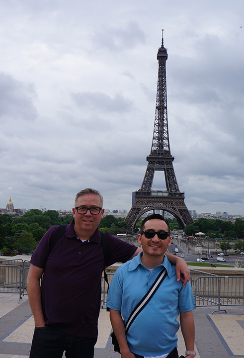
Yes the Eiffel Tower is romantic.  Who wouldn't love wandering through Paris, even on a rainy day and catching that very first glimpse of one of the world's most iconic (and romantic) structures?


Who doesn't love taking delightful snapshots of and with friends while the tower looms beautifully in the background?


And who can possibly denounce the spectacular views of Paris seen from the Tower's staggering heights?


I won't belittle any of those things.  But what I loved most about the Eiffel Tower was its monumental tribute to the Industrial Age.  I loved the steel. I loved the geometric patterns of its engineering. I loved the gears and pulleys that defy gravity and hoist young and old lovers alike to new heights of romance.  So here are a few of my favorite photos from a visit to le Tour Eiffel in all its Industrial-Age glory.


Sunday, March 3, 2013

The sunromedy fun from Sundance.

In a recent post, I introduced a new genre of movie that I hope will catch on: The sunromedy, a romantic comedy with the edginess and quirkiness of a Sundance movie.  The movie that inspired the term is "In a World . . . " written, directed, and starring Lake Bell.  That movie won the Sundance Waldo Salt Screenwriting Award. On the second to the last day of the festival, I saw Austenland from director Jerusha Hess who co-wrote the film with Salt Lake City native and University of Utah graduate, Shannon Hale.   Hess is a graduate of Brigham Young University and co-wrote Napoleon Dynamite with her husband, Jared Hess. Hale is the New York Times best-selling author of seven young-adult novels.  This movie, offers a story with a slightly more adult appeal.  This was a little bit of a locals-only dream team.

Austenland is the story of Jane Hayes, a modern young woman who is a self-proclaimed, Jane Austen super fan. That obsession is probably getting in the way of Jane getting on with her life.  But in a last effort to realize her dreams of an Austen-like romance, she spends all of her savings and heads to England for a stay at Austenland.  Once there, she renounces her modern life and lives the life of a Jane Austen character, although maybe not quite as lavishly as she had hoped since she didn't pay for the platinum package. At Austenland, Jane is courted by handsome young men played by actors.  And the charade even promises a proposal of marriage before the week ends.

Jane's adventures are numerous.  She befriends Miss Elizabeth Charming, a delightfully over-the-top guest played by Jennifer Coolidge. She falls for the "non-actor" stable boy Martin played charmingly by Bret McKenzie of Flight of the Conchords fame.  And she even manages to both ignore and romance the cold yet devastatingly dreamy Mr. Henry Nobley.  This Darcy-esk character is perfect as played by JJ Feild.  I challenge any Jane Austen fan (or even non Jane Austen fan) to not fall for Mr. Nobley.

Austenland is a delight. And you really don't need to know anything about the works of Jane Austen to enjoy the movie.  Just the general knowledge of Austen and the time she wrote about will ensure you'll have a good time at this quirky film. I'm glad it's already been picked by Sony for a release later this year.  Because I'd like to see it again, if for no other reason than the numerous, quotable lines.